
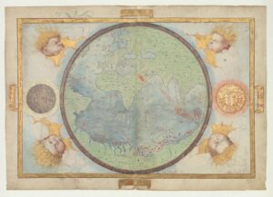
A chart of the Indian Ocean by Diogo Homem, appearing in the Universal Atlas and dated to around 1564. Image courtesy of M. Moleiro Editor (www.moleiro.com)
The Portuguese were the first to have an understanding of the ‘core’ continents beyond Europe; of Africa, Asia and the Americas. From these discoveries came some of the most amazing maps and charts of the Age of Discovery. And what some consider to be the most beautiful.
As the pioneering maritime navigators of the era, they regularly produced practical nautical passage charts as records for use on future voyages to Asia and Brazil. But some of their most gifted mapmakers were able to take these utilitarian images one step further and turn them into stunning artwork.
The Homem family of Lisbon were such mapmakers and the history of the above map starts in Lisbon in the early sixteenth century. Lopo Homem was acknowledged in 1517 by King Manuel as the ‘master of our maritime charts’. With Jorge Reinel, Lopo was an ‘examiner in the art of navigation’ and together they produced the stunning Miller Atlas in 1519. This atlas consisted of a series of parchment sheets portraying a World Map, the Mediterranean, European waters, the North and South Atlantic Oceans, the Indian Ocean and the region of the Spice Islands.
It was a combination of Portuguese brilliance in maritime cartographic science and the beautiful art of medieval calligraphy and illumination.
The Miller Atlas was a snapshot of geographical knowledge of this era when discoveries were proceeding apace. It actually reflects much less than was known in 1519 and is relatively accurate only as far east as Sumatra, after which it is much less realistic. This was not because these regions were as yet undiscovered–the Portuguese mapped the Spice Islands by 1512–but because the creators were reticent to give away too much detail to anyone seeking to find the lucrative clove and nutmeg islands.
The fact that Portuguese renegade Ferdinand Magellan was at that very time on a trip to locate the Spice Islands from the west with arch-rival Spain has been suggested as the reason that the Pacific Ocean is shown as enclosed in the Atlas.
The only map in the Miller Atlas that features no latitude or parallel scales, this mappamundi shows the hemisphere of the Portuguese empire. It clearly indicates no way into the Pacific from the east–from where Magellan was then approaching. Courtesy Library of Congress.
While the identity of the makers of the Miller Atlas is fairly clear, the purpose is not. Some maintain it was produced as a gift from the Portuguese monarch to his French rival, but such a gift would contradict a deliberate and longstanding Portuguese policy to restrict geographical knowledge from potential competitors.
More probable is the theory that the Atlas was a gift from King Manuel to his third wife Queen Eleanor. After Manuel died in 1521, Eleanor left Portugal and eventually married King Francis I of France, and this is where the Atlas later turned up before the single surviving copy was acquired by the National Library of France, where it remains.
Lopo Homem continued as a crown mapmaker for several decades; his last known work was a planisphere from 1554. He also trained two of his sons in the art of cartography; Andre and Diogo.
Andre Homem’s 1559 planisphere. It shows the family style of combining navigational charts with artistic decoration. One of Lopo Homem’s sons, Andre was a court cosmographer to the French crown. Courtesy French National Library.
Diogo ran into trouble with the law and was exiled to Morocco. His father paid bail and the lad then fled to England and later to Venice. As a skilled cartographer, and privy to some of the secrets of Portuguese exploration, he was in demand for private commissions and continued making maps in Venice until his death in the 1570’s.
During his time in Venice, he oversaw production of the outstanding Universal Atlas, produced around 1564. This contains 16 glorious maps on parchment, including a world map. The Atlas was acquired for the Imperial Library by Czar Alexander III in 1860, and remains in the collection today of the National Library of Russia.
One spread of the Universal Atlas, showing the Indian Ocean, I find to be certainly the most attractive and one of the most fascinating maps of the epoch. This map, Map Number 9 of the Atlas (shown at the top of this page) is titled “Coastline from the Persian Gulf to the Far East and the western part of the Eastern Archipelago.”
The brilliance of the hand-coloured coastlines is definitely alluring, but there is much more to this map than just pretty colours.
For one, it shows the Indian Ocean, the South China Sea and the Java Sea as only the Portuguese knew it at the time. When it was produced, only one non-Portuguese expedition had sailed around the Cape to the Indies–the French Parmentier brothers who both succumbed to disease in Sumatra in 1529.
Until Drake arrived on his circumnavigation fifty years later, the Portuguese flag was the only European one flying in the seas of Asia that came by way of the Indian Ocean–the Spanish, of course, arriving from the east, across the Pacific. So, few Europeans had the faintest idea of what Asia looked like; many learned scholars still considered the Indian Ocean closed off by encircling land masses.
Secondly, the map gives a fascinating glimpse of contemporary empires, including Persia, Gujerat, Malabar and Malucco, and Portuguese bases–represented by the royal coat of arms of Portugal–in present day Oman, India and China (though none existed here at the time the map was made).
Thirdly, the artistic embellishments really stand out, showing that this is a political document, to be admired, but also one that marks the ground of Portugal. ‘Don’t cross our line’, it says. The colourful tents, the regent astride his throne, the sea monsters are all meant to portray the geopolitical complexities and dangers of voyages to the Orient.
But fourthly, it is also a map derived from navigational charts, and though no-one could sail unhindered with it as their guide, it has elements that navigators relied on; the prominent compass-roses, crisscrossing rhumb lines, the graduated meridians, the Tropic of Cancer and the Equinox.
Fifth, it shows the dangers of coastlines from a sailor’s perspective. Island chains like the Laccadives, the Maldives, the Andamans, the Nicobars, and the reefs of the South China Sea are clearly marked as extensive dangers: beware interlopers!! River mouths for shelter, ship-wrecking sandbars, isolated reefs and shallows are all shown, not in a scale that would help a skipper, but to warn, again, of the endless hazards. Only two Portuguese carracks sail the seas; there are no local craft shown at all. Portuguese waters!!
Look for example at the Andaman Islands and the Strait of Malacca, where the topography is upside down for an approach from India, and the numerous perils of the Strait themselves, and the barrier of the Paracels off Vietnam. Enough to deter any sane captain.
The map stops at Timor–the green island in the extreme bottom right–purposely avoiding showing the Spice Islands to their north, which Portugal was busy plundering of cloves at the time. Lopo didn’t want to give away too much.
All in all, it’s a magical and wonderfully artistic map, and perhaps the most stunning of all those that came down to us from the Age of Discovery. It represents the heady era where little Portugal led the world in geographic knowledge of the planet, charted the route from Europe to China and the seas in between, and (briefly) ruled the South Atlantic, Indian Ocean and China Seas.
Portugal, I salute you!!